Logo Concept
Color Palette
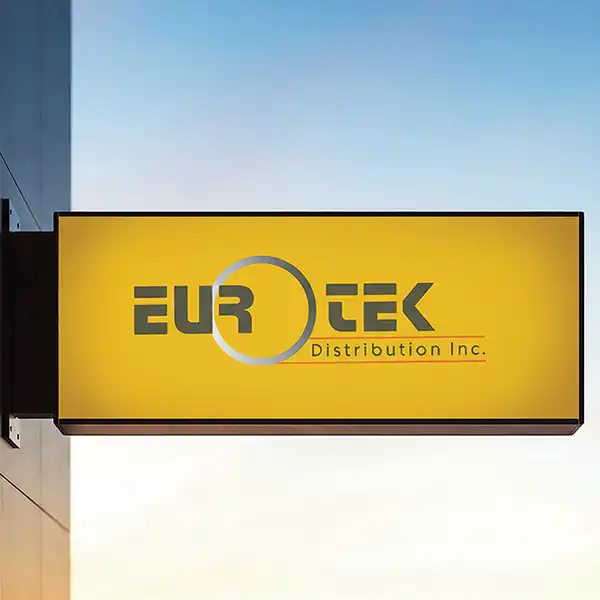
EuroTek logo works well for performance motors
The logo is well suited for performance oils, European car specialization , and racing or high-speed automotive markets, appealing to technical, quality-driven audiences such as mechanics, distributors, and performance shops. By avoiding common clichés like flames or exaggerated speed fonts, it maintains a more premium, refined, and trustworthy feel that aligns with professional and performance-focused brands. “ Distribution Inc. ” is secondary, clearly positioned as a descriptor rather than the brand focus. The underline visually separates brand from descriptor, improving clarity and legibility at smaller sizes.
This logo successfully communicates: European engineering • Performance • Reliability • Precision • Controlled speed It’s well-suited for a high-quality oil brand targeting speed cars, especially in a professional or distribution-driven market rather than consumer hype.
Gray tones communicate: Engineering precision Metal, machinery, and automotive components Neutral professionalism (common in Euro automotive brands) The orange accent line is very effective: Adds energy, speed, and heat (oil, engines, performance) Creates a visual underline that grounds the logo Prevents the logo from feeling too cold or corporate Orange is especially appropriate for performance oils, where heat, friction, and power are key associations.
Typography
Overall, the logo Impression
The custom, geometric sans-serif type feels mechanical and engineered. Letterforms are solid and slightly condensed, reinforcing strength, durability, and performance. The stylized “ R ” adds character and motion, subtly hinting at innovation and speed without being literal. Spacing is balanced and clean, supporting a professional B2B-focused brand (distribution, performance products).
The logo communicates precision, engineering, and efficiency, which aligns well with a Euro-tech, high-performance automotive oil brand . It feels industrial, modern, and controlled, rather than aggressive or flashy—suggesting confidence and technical credibility.
For Social Media Approach
Other Jobs
The E uroTek Distribution Inc. logo is engineered for the high-performance automotive market, communicating precision, reliability, and controlled speed without relying on typical racing clichés. The design features a custom, geometric sans-serif typography that feels mechanical and solid, reinforcing the strength and durability expected in European automotive engineering . A vibrant orange accent line cuts through the professional gray tones, adding a spark of energy and heat that perfectly symbolizes performance oils and engines. Overall, this identity captures the essence of technical credibility and modern industrial power.
Ready to Grow Your Brand?
For your next Design | Marketing Project
Let’s turn your ideas into something bold, beautiful, and beyond. We love meeting new brands, chatting about ideas, and finding creative ways to make your business stand out.
THE GALLERY



Ready to Grow Your Brand?
Let's turn your ideas into something bold and built to perform.